What GetHelp! does:
– Give users a way to get help from other users as soon as possible
How it works:
– Have a page for users to post thier needs
– Have project pages for users to get responds from peers
What’s the prob now?
– The UI is not so cool, the app’s supposed to help user get quick responds from peer, therefore it should help user to quickly, accurately describe their needs.
Why the UI’s not so cool?
1. Navigation issue

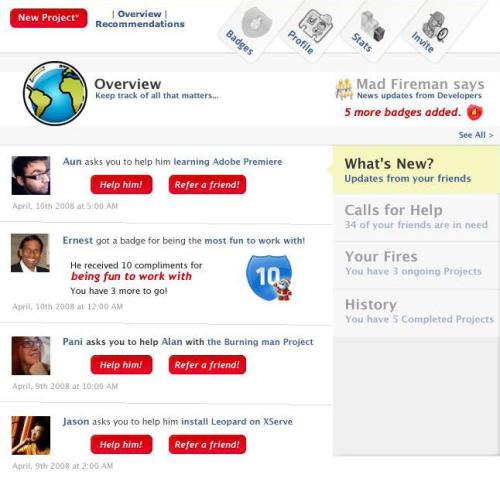
– Slanted tabs are not cool, it just make user harder to read. Make the “tabs” straight for the sake of users’ eyes
– 3 styles on a single navibar are not cool at all. It needs style consistency. Overview and Recommendation pages are also very important, rather than Stats page, so their icons should also as big as others.
– There’s no way to go back to main page? It needs the HOME button on the navibar.
– The keywords are not precisely describe the meaning of pages. I.e. Overview should be simply Feeds.
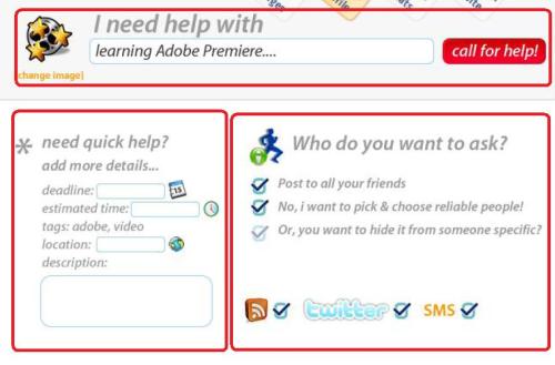
2. Problems of Get help section on homepage

– Call for help button at top makes users forget about filling infomation at other sections!
– “Need quick help” and “Who do you want to ask” placed side by side makes people think they must choose to fill the left or the right. After filling forms, users then must find the Submit button, what should be after the form, rather than next to the title.
– So, it’d be much more better if they places the boxes in the following order :
First, “I need help with” box, with an “Details button”. They can submit it without filling details, or if the user wanna fill in details, the “Need quick help” box are open below, and the “Call for help” button move to below that box. Similarly, users can choose to open “Who do you want to ask” box or submit as it is
3. Problem of Overview page

– The numbers of feeds per page are too small : only 4 slots per page. This means, the last 4 of 30 will need 8 navigation step to be reached! This can be solved by reduce the size for each slot, reduce the size of the “Overview – Keep track of all that matters…” box.

What do you think is the common issue with the whole thing (not as separate pages)?